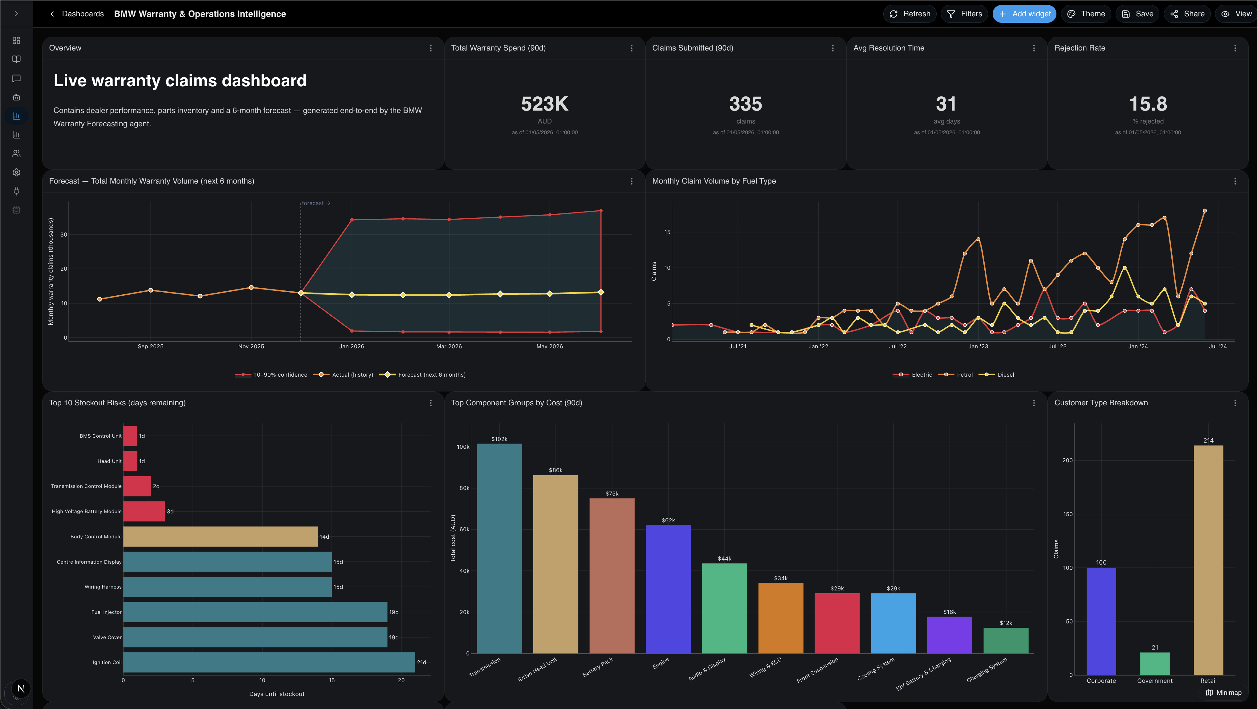
ASK · ANALYTICS

Stop building dashboards. Start asking questions.

Certant Analytics finds your data, builds the chart, and explains what changed. In plain English. With sources you can click.

WHY BI HURTS — AND HOW WE FIX IT

Three ways most BI tools fail you.
Three ways Certant doesn't.

01
The problem

You have to know what chart to build.

Bar? Line? Stacked? Most people give up before that.

Certant's fix

Natural-language first.

Type a question. Get a chart. Refine in conversation. Like Tableau Pulse — but grounded in your documents and your data together, not just your warehouse.

02
The problem

You have to know which table the numbers live in.

Or wait three days for someone in the data team to point you.

Certant's fix

Auto-discovery.

Connect your data once. Certant finds the relationships, the joins, the names that go together. No semantic layer to maintain by hand.

03
The problem

You have to trust that the answer is right.

And there's no easy way to check.

Certant's fix

Grounded answers.

Every metric, every change, every "why" comes with the source row, paragraph or document. Click. Verify. Move on.

A REAL DASHBOARD

Generated end-to-end. Read at a glance.

One question — "How are warranty claims trending?" — and Certant assembles a live dashboard with the right charts, the right joins, and the right baselines.

Certant Analytics — BMW Warranty & Operations Intelligence dashboard
EVERY CHART YOU NEED

Six widget types. Seventeen chart types. One picker.

Auto picks the right chart for the data you describe in plain English. Or pin a specific type — every option below is a primitive the agent can compose into a panel.

Chart

Plot data from a saved DB connection.

KPI

Single number from a SQL query.

Table

Paged query results.

Text

Markdown notes / headers.

Image

Static image by URL.

Divider

Visual separator.

Chart types
Line
Trend over time.
Multi-line
Compare several series.
Area
Cumulative magnitude.
Bar
Compare a few categories.
Stacked bar
Category totals broken down.
Top-N bar
Ranked categories.
Pie
Share of a whole.
Donut
Share with centred value.
Scatter
Relationship of two numerics.
Bubble
Three numeric dimensions.
Histogram
Distribution of one numeric.
Box plot
Distribution across categories.
Treemap
Hierarchy / proportion.
Correlation matrix
Numeric-column correlations.
Forecast ribbon
History + prediction band.
Geographic — points
Lat/long markers.
Geographic — heatmap
Density by location.
COMPARED

Old way vs Certant.

The old way With Certant
Building a dashboard Half a day, a Slack thread, and a BI ticket A sentence and three seconds
Explaining a number "The data team will get back to you" A paragraph + the source
Adding a new question A new chart, a new request Just ask
WHO IT'S FOR

Built for people who don't have a data team.

Most of our customers don't have a Tableau analyst. They have a head of ops, a board paper due Friday, and 10 spreadsheets nobody owns. That's who Analytics is built for. The analysts love it too — they just stop being the bottleneck.

Every answer cites its source. Every dashboard inherits your permissions. Every question runs inside your perimeter, if that's where you need it.

See it find the chart for you.

Bring a question. We'll do the rest.